Whether it’s your very first time sketching the human figure or you’re here to refresh your skills, this guide will help you draw from life like a pro. Let’s dive in, c’est parti!
1. Human Proportions
Starting at the beginning, if you’re wondering whether there’s some hidden equation governing proportions, sorry to disappoint, there isn’t. Many have tried to devise a mathematical formula for the “perfect” human figure, but these efforts always fall short, not only because real bodies rarely match idealized measurements, but also because drawing inevitably involves perspective. That said, a few simple rules can be helpful. The body’s midpoint always sits slightly below the belly button, meaning the legs make up a little less than half of the total height. The arms are shorter than the legs, with the elbows roughly lining up with the waist and the hands reaching about mid-thigh.
All of these proportions work well for a standing figure, where perspective distortion is minimal, including the famous contrapposto pose. However, seated or reclining poses inevitably introduce something called foreshortening. Foreshortening occurs when a body part appears shorter than it actually is because it recedes into space. You’ve probably noticed this many times. Interestingly, we often assume a figure looks realistic because of the artist’s deep understanding of proportions and anatomy. In many cases, however, the effect is achieved through the correct use of perspective to depict foreshortening. This creates the illusion of depth in a two-dimensional sketch, naturally pulling the viewer in. For example, in a seated pose, the thighs are shorter and more compressed compared to the calves, even though we know they aren’t actually shorter in a standing figure. This effect is caused by foreshortening. So, how do we handle this in life drawing, and more generally, how can we determine if the proportions are correct?
For quick poses, where time matters, the key is to compare the relationships between body parts. Drop imaginary lines, or hold up your pencil vertically, horizontally, or diagonally, to check how features align and at what angles they meet (Figure 1). For longer poses, that approach is still useful, but you can also try a measuring system that uses the head as your basic unit. Hold your pencil with your arm fully extended, align the tip with the top of the head, and place your thumb at the chin. That’s one “head unit.” Then, see how many head units fit into the rest of the body or into a specific body part (Figure 2). If the head isn’t visible, just pick another reference point. In portraits, for example, where you can’t use the head, artists often use the eye instead. Remember, however, to always keep your elbow locked when measuring. There’s a reason artists hold their arm straight, and it’s not just to look smart! Bending your arm while measuring will give you inconsistent results.
Here’s a side-by-side look at the two methods for assessing proportions. Do you have a favorite already, or will you give both a try?
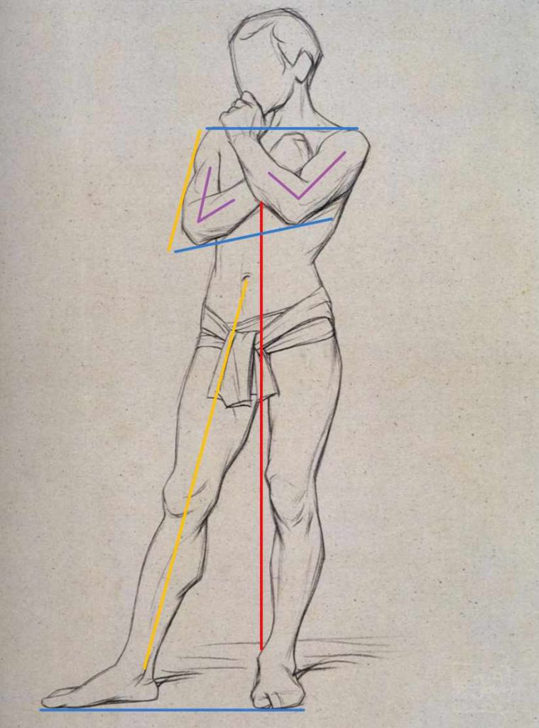
Figure 1. Just a few simple straight lines can help you see proportions by comparing how body parts relate to each other. Take a look at how the crossed arms line up with the ankle of the weight-bearing leg. Notice how this line acts as a central axis, even though the belly button isn’t perfectly centered on it. In your drawing, this line will help structure most of the body. Now notice how the shoulders and feet sit on straight horizontal lines, while the elbows follow a gentle tilt. Both elbows are clearly above the waist, even though in a relaxed arm position they would align with it. An imaginary diagonal line running through the leg connects the belly button to the ankle and shows the leg and arm are parallel. Finally, observe the arm angles: one elbow bends at 90°, while the other forms a sharper angle. All these lines help you judge proportions in a human figure in an indirect yet elegant way, working particularly well in complex and short poses.
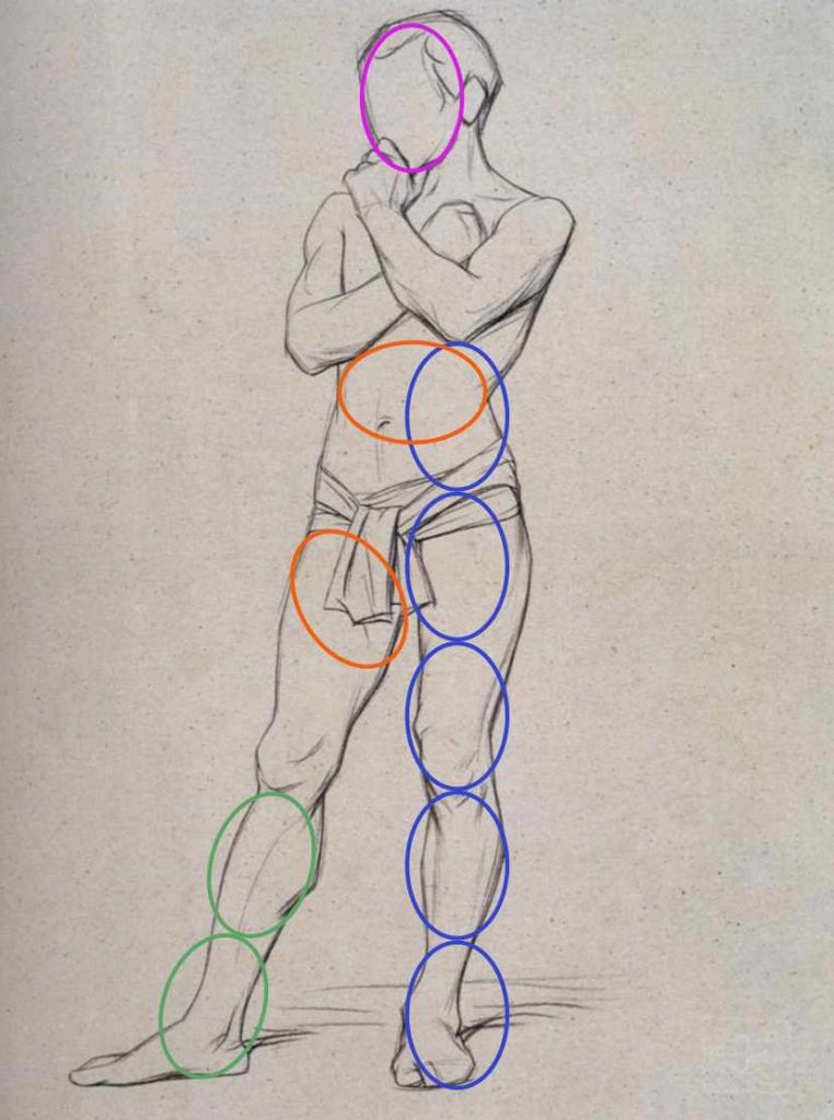
Figure 2. Using the same drawing, you can see how the “head unit” measurement helps establish proportions. This approach works best when most of the model’s head is visible and the pose is longer. Notice how we’ve approximated the position of the top of the head and the chin to establish our “head unit.” That’s absolutely fine, as long as you keep the approximate unit consistent while measuring. Then we use it to check lengths across the figure. In our example, we measured the distance from the elbow to the sole as five heads, while the distance from the knee is only two heads. Note that the latter measurement was taken diagonally! The “head unit” can also be used to gauge width. Here, we compared the width of the thigh with the waist.
2. Line vs Tone
In many life drawing workshops, including ours, you’ll work on poses ranging from 2 to 20 minutes. In general, short poses help you warm up your hand and are perfect for capturing the energy of the model with line, while longer poses give you time to work on proportions, details, and, of course, explore tone, which is the full range of lights and darks that add volume and depth. Many artists like to combine line and tone to create bolder, more expressive drawings. It’s your drawing, and you make the rules! However, in classical figure studies that last hours or even days, you’ll notice that tone eventually replaces line entirely.
Pro tip: The pencil is a fantastic tool when starting out with life drawing, allowing you to work with both line and tone. Instead of a standard HB pencil, I recommend using 2B to 9B pencils for softer, darker marks that are ideal for creating a range of tones from light to dark. Another helpful trick many artists use is working on toned paper, which can greatly speed up your drawing since the paper itself acts as a base color for the figure. You can then focus on adding darker tones for the shadows and using white for lighter tones or highlights.
Now, let’s take a closer look at how line and tone can add realism and interest to your figure drawings.
Line Drawing
Lines are perfect for capturing movement and energy, which makes them ideal for 2 to 5 minute poses where the focus is on gesture rather than detail. Even though line can seem like a limited means of expression, your drawing can still be engaging. Vary your line weight. Heavier lines bring forms forward, while lighter ones push them back. A very thick line can suggest shadow, while omitting parts of the line can be just as effective in indicating highlights. Another approach is to use two different colors or different tones of the same color. Line drawings exist to convey energy, motion, and vitality, and they aren’t meant to be flawless. For that reason, they have their own expressive power and can stand as complete artworks, rather than merely serving as preparatory sketches or warm-ups.
Mastering Light and Shadow
Once poses last 10 minutes or more, tone becomes your best friend. Line is still useful for the initial placement of the figure on the page, mapping out proportions, and naturally letting your artistic expression shine, but it’s tone, the play of light and shadow, that gives your drawing its wow factor. Tone is what makes your figure pop off the page and gives it a sense of three-dimensionality. The process of adding tonal values is called shading, and the basic rule of shading is that forms gradually become darker as they receive less light. Here’s how it looks in practice.
In most cases, light comes from above, whether it’s natural daylight or studio lighting. The upper parts, such as the head and shoulders, catch the most light and are rendered in lighter tones, while the lower parts, like the legs, receive less light and are depicted in darker tones. The feet are an exception, as the tops of the feet face the light and are therefore slightly lighter than the legs. The torso falls somewhere in between.
The light also often hits the figure from the side rather than straight overhead. This means that one side of the body always receives more light than the other. For example, when the light comes from the right, the left side naturally receives less light, sometimes falling entirely into shadow. Shadows indicate the areas where direct light doesn’t reach, and when working with tone, many artists begin their figure drawings by precisely mapping out the shadows first. A helpful trick is to squint at the model, which simplifies the range of tones and helps you focus on the divide between light and shadow. You can think of it as breaking the figure down into just two kinds of shapes: light and dark, with the dark shapes standing in for the shadows. Separating light and shadow at the start is important because it makes shading easier, allowing the darkest tones to be reserved for areas in shadow and the lighter tones for areas in light. If you mix them up, the drawing will quickly appear messy and unrealistic.
Last and just as important, even though the darkest values are reserved for the shadows, they aren’t simply solid blocks of dark tone. You’ll often notice lighter areas within the shadows, called reflected light. They appear when light bounces off nearby surfaces and softly illuminates into the shadow. Despite being called “light,” reflected light still belongs firmly within the shadow family and should always be darker than any of the actual light areas. Shadows on the figure can include different amounts of reflected light, but the core shadow is always the darkest part of the shadow. Some artists allow the core shadow to stand out while letting the rest of the figure blend with the background, creating more engaging figure drawings.
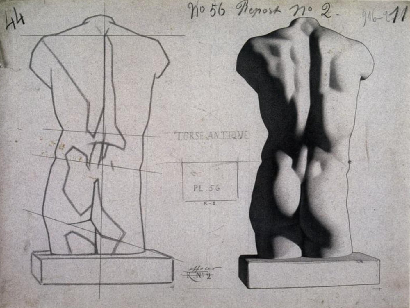
Now, here’s one of the most overlooked truths about tone. Not all tones are equally present in a drawing. This depends on the lighting setup, of course, but if you compare beginners’ work with master drawings, you’ll notice a clear difference. The figures in master drawings appear sharp and clean. This is because the darker mid-tones, those approaching the shadows, are often underrepresented compared to the lighter tones or the shadows. When there are too many mid-tones the contrast is low, and often there is no clear focal point to draw the viewer’s attention. The result is a drawing that looks muddy and a figure that appears overworked. In Figure 3, you can see lights, mid-tones, shadows, and reflected light working together in one complete drawing.
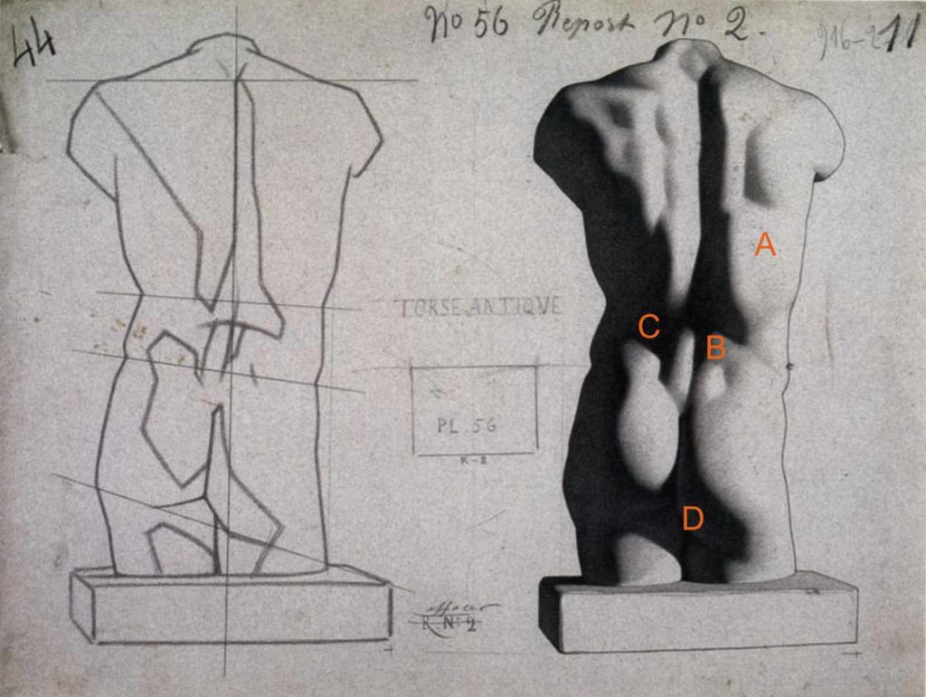
Figure 3. Straight lines mark the initial light-shadow divide, showing how the artist separates areas of light and shadow. Notice the horizontal lines that indicate the body’s gradual tilt. The final drawing shows lights (A), mid-tones (B), shadows (C), and reflected light (D) across the forms, clearly illustrating the full range of tonal values used in figure drawing.
The Power of Focus
Finally, using varied edges in a drawing is a powerful way to add visual interest and realism. Many artists achieve this by employing the concept of lost and found edges. “Lost” edges are soft contours that blend into neighboring shapes, while “found” edges form crisp, distinct contours, creating areas of focus and directing the viewer’s attention. Sharp edges naturally guide the eye through your work, while soft edges deemphasize certain areas, helping to simplify the scene.
Here’s an overview of where to find sharp and soft edges in a drawing or painting.
Sharp edges:
– sudden plane changes
– tones and colors next to each other that contrast
– areas that should draw the viewer’s attention
Soft edges:
– subtle plane shifts
– gradual transitions of tone or color
– parts farther from the focal point or in backgrounds
Mixing both types of edges adds depth, focus, and rhythm. Great edge work doesn’t just make a drawing look realistic. It also gives it a sense of mood and atmosphere.
3. Figure Drawing from Start to Finish
Now you know about proportions, line, tone, and a bunch of other drawing basics to impress your peers. But how do you actually bring it all together? Here are three simple approaches to drawing a figure from life that you can rely on no matter which life drawing workshop you attend.
The Traditional Approach
Start with light lines to map out the proportions, then add tone to build depth before moving on to details. Focus on refining one or two key areas to draw the viewer’s attention. It could be a dramatic shift between light and shadow, an expressive face, or the elegant curve of the torso echoed in other forms. It’s up to you! Give it the finishing touch with highlights and a cast shadow.
The Bold Approach
Skip the traditional setup and dive straight into tone, or even color. If you try the latter, experiment with colored pencils, pastels, charcoal, sanguine, or paint. Water-based media like watercolor or ink can produce beautiful results, but they’re a bit trickier because of drying time. Add lines and tone for rhythm, balance, and structure as you go. Keep adjusting and refining, but always remember your focal point. This is where you want the viewer’s eye to finally rest.
The Academic Approach
This method is ideal for longer poses or painting workshops. Begin by carefully establishing proportion while focusing on anatomical accuracy. Remember the “head unit” for measuring and dropping lines to find alignments and angles between body parts. Build your drawing slowly: first establish shadow shapes, then develop the lights. Work from large forms to small details. Finish by refining edges and background elements and adding highlights, reflected light, and cast shadows, all to make your figure stand out beautifully.
4. What Next?
Life drawing isn’t about getting everything exactly right. It’s about learning to observe. Focus on the feeling you want your drawing to convey, let your own style shine through, and most importantly, enjoy the process along the way.
Life drawing has been a cornerstone of artistic training for centuries, and its principles remain just as relevant today. The examples here come from a famous 19th-century French figure drawing course by Charles Bargue and Jean-Léon Gérôme. It was created to guide artists step by step, from drawing plaster casts to studying masterworks and eventually working from live models. Even artists like Vincent van Gogh, Pablo Picasso, and John Singer Sargent practiced from the Bargue plates. It’s definitely worth checking out if you want to see firsthand the foundations that shaped some of history’s greatest artists.
I hope you enjoyed our guide to drawing the figure from life. If you’re inspired to try these tips yourself, join us at one of our life drawing sessions. To explore the wide range of styles and approaches our participants experiment with during workshops, visit our Instagram page and see what our community is creating. À bientôt!
—
About the author: Maria Kuzma-Kuzniarska, a medical illustrator and former researcher at Oxford, is the founder of Life Drawing Montmartre. For over ten years, she has been organizing bilingual life drawing workshops in Paris.